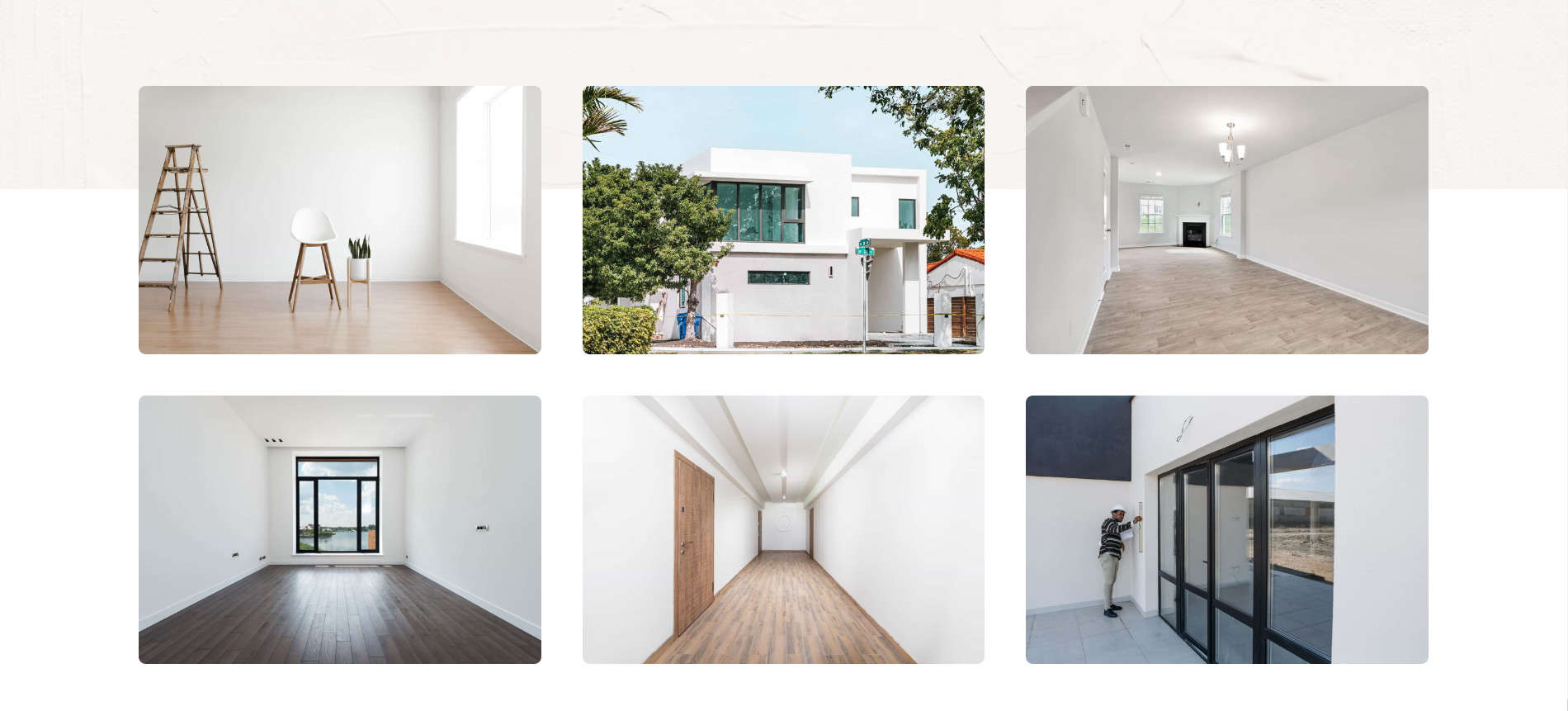
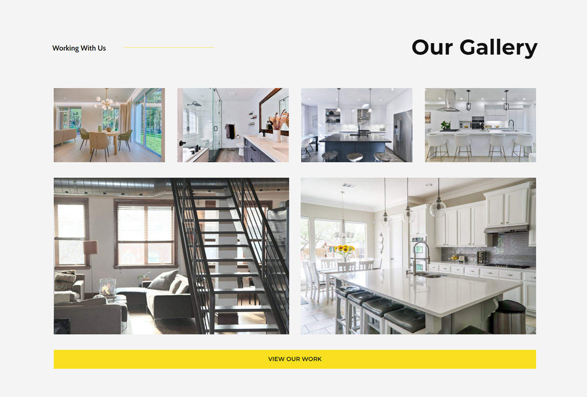
Gallery Page Section Layouts

gallery for desktop

The image depicts a typical gallery page section with two images displayed.

A gallery on a website displays a collection of images or multimedia content in an organized and visually appealing way. It can showcase products, present portfolios, or highlight events.

Galleries often use a grid layout to show multiple images at once or a slideshow format where images appear one after another. Some use a masonry layout, arranging images of different sizes in a non-uniform but attractive manner.

Interactivity is key, with features like clickable thumbnails, a lightbox effect that enlarges images, and zoom and pan capabilities. Galleries can include images, videos, and audio clips.

Customisation options may include captions, descriptions, filters, categories, and responsive design to ensure functionality on various devices.

Common uses include e-commerce sites, photography portfolios, event highlights, and art exhibits. Integrating a gallery into a website enhances the user experience and effectively presents visual content.

Feel free to explore the examples below and find the perfect gallery design that fits your project’s requirements.

Section 1

gallery image

The mobile view

gallery image

The desktop view

Notes:

  • This section displays 6 images, arranged in single column on mobile device and two rows of three on a desktop.

View in a browser:

  • Please click the button below to see the page section in a browser, scroll down to find the correct section.
  • If on a desktop, try narrowing the browser window to see section in mobile view.

Section 2

Am image of  gallery page section

The mobile view

Am image of  gallery page section

The desktop view

Notes:

  • This section displays a number of images and areas with text arranged in a single column on mobile devices and two rows of three on a desktop.

View in a browser:

  • Please click the button below to see the page section in a browser, scroll down to find the correct section.
  • If on a desktop, try narrowing the browser window to see section in mobile view.

Section 3

An image of  gallery page section

The mobile view

An image of  gallery page section

The desktop view

Notes:

  • 4 images are displayed in a single column on mobile devices and one row of four on a desktop.
  • The section is full screen width
  • A box with text is applied at the centre of each image.

View in a browser:

  • Please click the button below to see the page section in a browser, scroll down to find the correct section.
  • If on a desktop, try narrowing the browser window to see section in mobile view.

Section 4

gallery image

The mobile view

gallery image

The desktop view

Notes:

  • The images in the gallery can be viewed by dragging the mouse on a desktop or swiping on a touch screen.
  • This section displays two images side by side on a desktop and a single image on a mobile.
  • Some dots under the images indicates which image(s) are displayed.

View in a browser:

  • Please click the button below to see the page section in a browser, scroll down to find the correct section.
  • If on a desktop, try narrowing the browser window to see section in mobile view.

Section 5

Am image of  gallery page section

The mobile view

Am image of  gallery page section

The desktop view

Notes:

  • This section comprises a title, some descriptive text plus 6 images.
  • The text is centred.
  • The images are arranged in a single column on a mobile and 2 rows of 3 on a desktop.
  • An indicator of dots indicates which image is displayed.
  • The section is displayed at the width of the the site’s content..

View in a browser:

  • Please click the button below to see the page section in a browser, scroll down to find the correct section.
  • If on a desktop, try narrowing the browser window to see section in mobile view.

Section 6

Am image of  gallery page section

The mobile view

Am image of  gallery page section

The desktop view

Notes:

  • This section This section comprises a headline, title, 6 imaes and a button.comprises a headline and title, some explanatory text followed by a number of questions.
  • The text is centred on a mobile and arranged left and right on a desktop.
  • The images are arranged as a single column on a mobile and 2 row of 4 and 2 on a desktop.
  • The button can link to a more detailed page.

View in a browser:

  • Please click the button below to see the page section in a browser, scroll down to find the correct section.
  • If on a desktop, try narrowing the browser window to see section in mobile view.